The Subscription Duration template shows how long subscriptions have historically remained active in a given date range.
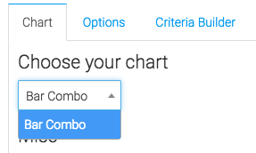
Chart Tab
From the chart tab, you’ll see it is displayed in a bar graph.
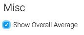
You have the opportunity to show the overall average by checking this box.
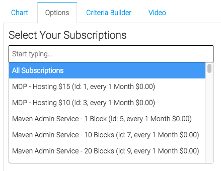
Options Tab
First, we’ll select the subscriptions we wish to measure.
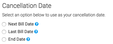
Next, we’ll select our cancelation date.
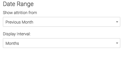
Finally, we will select the date range.
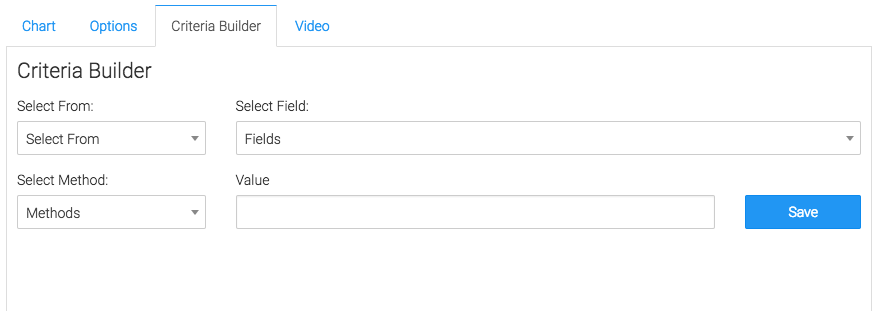
Criteria Builder Tab
For ultimate control and customization, use the Criteria Builder.
Relevant Articles to Subscription Duration
- How to Configure the Subscription Stick Rate Report
- How to Configure the Subscription Tenure Report
- How to Set Up the Subscription Cancellations Report
Create Your Free Graphly Dashboard
You don’t need to struggle to find the data you need from your Infusionsoft or Keap application. Create a free visual dashboard using the Graphly Lite plan. Using Graphly Lite, you get 1 user, 2 dashboards, and access to our 10 most widely used report templates. These templates include:
- Tags Applied
- Tags Applied Goal
- Leads
- Gross Revenue
- Appt | Note | Task Summary
- Email List Health
- Refunds
- Campaign Email Stats
- Text Widget Area
If you don’t already have a Graphly account, click here to get a Graphly Lite account so you can start making more informed decisions and grow your business.